Ye Riddel-Mastre
Now that I've really stared the behemoth of a project I've created for myself in the face...it's time to think about the following behemoth of a project. At least this one will be planned with a very specific aim. And timeframe. And I think I know what I'm getting into? Probably not, but that's okay.
I've been wanting to make an entirely hand-written and -illuminated book for years now, and always thought I'd decide on Rose Daughter when I got around to it. Rose Daughter is my comfort book and has been since I discovered it in middle school; it's the first book I read when I move into a new place, and the book I turn to whenever I need reassurance or warmth or a quiet place to go for a while.
It...also feels like a book that would rather be printed and illustrated than made medieval.And it has about 95,000 words, but let's not be vulgar about word count. So I needed a different option...maybe The Last Unicorn? It's almost exactly the same length, if you're wondering. And then I thought, Patricia A. McKillip's Riddle-Master trilogy feels right for this project and for 12th-century illumination and calligraphy. I love the whole series deeply. I wouldn't get bored of it. The first book only has 70,000 words. Excellent. I know what I'm writing.
As for how to write it...well. I know I'm not interested in making ink, pens, or paints for this project. Outside the scope I'm going for. Okay, so probably India ink or other calligraphy inks, and a metal-nibbed pen. I'm also not remotely rich enough to use parchment, vellum, or really convincing imitations of either. The search is on for paper that's sturdy, fairly smooth-surfaced but not glossy, translucent enough, and affordable. I feel like Goldilocks.
Meanwhile, I've been collecting references for calligraphic style (most likely I'm going with protogothic script, though late Carolingian appears to be used through the mid-twelfth century as well) and illuminations, looking at the colors and decorative motifs. I'd love to make this a clever project where each book in the trilogy appears to have been copied at a slightly later date than the preceding text, so the first will have foliated or otherwise fancified initials only at chapter beginnings, with colored initials at Moments I Think Are Important, as in religious texts where verse beginnings get colored initials. I'm planning to pick four or five moments to illustrate, as well; I'd like to do at least one full-page illustration, and a number of half-page illustrations.
And I'm not even thinking about making false ivory covers. I'm not. Really. Much.
I've been wanting to make an entirely hand-written and -illuminated book for years now, and always thought I'd decide on Rose Daughter when I got around to it. Rose Daughter is my comfort book and has been since I discovered it in middle school; it's the first book I read when I move into a new place, and the book I turn to whenever I need reassurance or warmth or a quiet place to go for a while.
It...also feels like a book that would rather be printed and illustrated than made medieval.
As for how to write it...well. I know I'm not interested in making ink, pens, or paints for this project. Outside the scope I'm going for. Okay, so probably India ink or other calligraphy inks, and a metal-nibbed pen. I'm also not remotely rich enough to use parchment, vellum, or really convincing imitations of either. The search is on for paper that's sturdy, fairly smooth-surfaced but not glossy, translucent enough, and affordable. I feel like Goldilocks.
 |
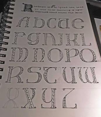
| These are not the correct style. I'm still pretty proud of them. |
And I'm not even thinking about making false ivory covers. I'm not. Really. Much.
Comments
Post a Comment