I had grand plans of leaping directly from finishing the green and peach silk bliaut to starting the handwritten and illuminated copy of
The Riddle-Master of Hed, but as it turns out...there's all this prep work to do. And calligraphy practice, as I am emphatically Not A Scribe.
 |
| Note I'm not changing all those "the"s to "ye"s. |
The first bit of prep being to go through the copy I bought
specifically to mark up, because my personal copy is
mineminemine and not for abusing like this, and make the little word-swaps and colored letters/words and ligatured letter combinations stand out from the rest of the text. Partly this is so I'm familiar with where these elements will crop up, and partly to make the text harder to read as I'm copying, so I'll be more inclined to read slowly and make fewer mistakes. And of course, partly it's to make a very modern English text
look like a 12th-century Latin text—so every instance of "and" will be replaced with "et," and i/j and u/v/w will each be written with a single character, not with modern additions to the medieval Latin alphabet.
 |
| I probably should have picked a passage with the word "instinct" or "instruction" in it. Those are pretty words once they're marked up. |
Turquoise boxes mark "st" and "ct" ligatures—the ones that will be least instinctive for me as a newcomer to the Carolingian hand I've chosen for this book. According to some of the manuscripts I've looked at for reference, "ti" and "tu" are often written with ligatures, and there's a secondary form of "r" used in "or" ligatures as well. Those are less likely to trip me up, though.
I've also chosen certain words to write with colored initial letters, or entirely in colored ink, as a nod to the practice of starting each line (or verse, possibly—I don't speak Latin) with a colored ink initial. I'm still deciding whether to only capitalize the first letters of sentences, or to keep the Capitalization For Emphasis that shows up throughout this book. 12th-century manuscripts appear to use internal capitalization rarely, if at all, so it would help the "medievally-ness" to skip it...but I love the formality of the ranks and honors that are capitalized in the original text. It's a quibble, but one I'd rather have resolved before I tear into the real paper for the project.
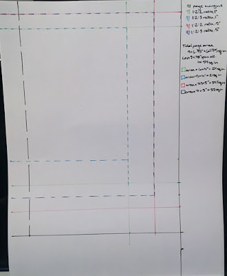 |
| RECTANGLES. So Exciting. |
Speaking of which...I spent some time measuring and marking different possibilities for the margins of my pages. The sheet size is more or less set by the rough size of book I'd like to end up with, and the size of a full sheet of my project paper, and my intense aversion to waste. I'll have sheets of about 9 x 13.5 inches, folded in half to make signatures with pages 9 x 6.75 inches. Incidentally, that's a very satisfying proportion, and it makes margins pretty easy to determine.
From the manuscripts I looked at, I saw a pretty common pattern of top-side-bottom margins at 1:2:2 or 1:2:3 ratios, so I tried each of those ratios with one "unit" equalling one inch and half an inch on a sheet with my final page size marked, to see what I thought of each of them. I like the one-inch top margin better than half an inch—it feels less cramped—but it makes the text block minuscule at those ratios, so I think I'll use the 1:2:3 ratio with half-inch "units" instead (dark blue dashed margins, above).
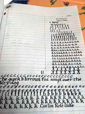 |
| I call this piece "Screaming." |
It occurred to me that I should probably have a go at a basic form of Carolingian before I touch my nice paper. Mostly I learned that I need more practice. And thicker paper, which I'd kind of guessed. I also need to do a lot of work on keeping my verticals...um...vertical.
 |
| I desperately need to practice differentiating my "r"s and "t"s. |
Overall, not bad. It becomes very clear, working with the text block I'm planning to use (and, conveniently, at the correct line spacing), that I need a narrower nib to allow me both space for ascenders and descenders, and to fit a few more words into the text block to stick closely to my page number estimate. I'm hoping for about 150 words per page, and I'm a bit short of that at this scale (besides being exceptionally bold for medieval text). Improving the verticality of the text will also help me cram a few more words in, as will becoming more familiar with how many letters I can fit into a line, so I can plan to break words in reasonable places.
However. I can't do any of this practice until I have narrower nibs to work with...which I had to order online...and which won't arrive until next week. So I'm moving forward with other, smaller projects, and doing my Inktober sketches with the extremely fine nibs that came in this pen pack to familiarize myself with how the pen angle affects the marks, and to learn the rhythm of dipping the pen.


Comments
Post a Comment